How To Convert Traffic Into Sales for Shopify stores?
So you’re driving traffic to your Shopify store, but somehow not getting any sales? If I told you that this is truly a blessing rather than a curse, will you believe me? Not persuaded, huh? Let’s take a step back for a minute. There’s this reality that you have to deal with that is you’re not making any profit despite the traffic you’re generating, but let’s look at the bright side here.
There’s definitely something going on. There are people who are interested enough in your brand or your ads to visit your website. But you do need to start converting some of the traffic into sales to stay in business. Luckily, this problem is not a rare one for eCommerce stores, and it’s one that you can solve.
Exclusive Offer: Get Shopify 33 days for just $1 + The Online Store Starter Kit
Start your 3-day free trial, and enjoy your first month of Shopify for 1$ plus the premium package designed especially for new Shopify merchants!
That’s exactly the reason behind this article – I’m going to cover what you need to do differently when you get traffic, but no sales. And the tips in this article will help you convert traffic to your Shopify store into sales. Now let’s jump right into the details.
Before you read:
- How to Optimize Conversion Rate for Shopify Stores?
- How to Improve Your Shopify Store?
- 19 Checklist Before Launching Shopify Store
1. Land your traffic on the right page

Let’s get things started with a fairly easy question: where are you landing your customers on your website? If you’re getting traffic, that traffic must be going somewhere on your website. You have succeeded with your Facebook ads, your social media message, or other strategies you have used to get potential customers to your website. But it can be the specific page of your site where you’re landing your visitors that hinders the chances of converting them to a paying customer.
What you need to do here is to land prospects on a page that offers the value that your marketing strategy has promised them. Let’s take a look at this example from Zalando to know what I mean:
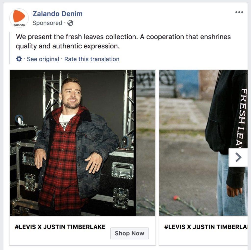
This is a carousel ad on my Facebook. Those who like denim, and like Justin Timberlake, will click on the “Shop Now” button. The Facebook ad will lead them to a curated collection page that highlighted a range of items from the partnership of Levis x Justin Timberlake. No particular items were highlighted in the commercial, so customers can land on a collection page where they can browse through at my leisure. This ad does deliver what it promises.
On the other hand, if Zalando had put the ad clickers on their homepage, for example, the visitors would have been very confused and probably just clicked off the tab. And that’s why it’s always necessary to know where your web visitors are landing. You don’t want to waste time, money, and effort selling your goods and landing them on a website that doesn’t meet their expectations.
If you’re landing your customers on a page that doesn’t suit your marketing messages, consider steering them to a different page or redesign your landing page – This can be the reason why you’re attracting traffic, but you’re not getting any sales.
2. Make your website easy to navigate

It is very easy for entrepreneurs who operate a brick and mortar store to provide prospective customers with a customized shopping experience. They will walk shoppers around their store, ask questions to help customers find what they’re looking for, give constructive feedback, and provide personalized service to any shopper who enters their store.
It’s a bit tougher for eCommerce companies to offer a similar service. You can always provide your customers with a great shopping experience, you just need to approach it from different angles. And one of the best things you can do is make sure that the design of your store is straightforward and that it’s easy to navigate without keeping a hand on your side.
If you get traffic but no sales, your store’s navigation could be one of the reasons why your visitors don’t convert. Think of it like this – you’re leading a target crowd of customers to a store they probably haven’t been before.
You have to come across as a professional, legitimate company. Why? Simply put, online shopping is all about trust and confidence. And there’s nothing that’s going to drain your confidence battery faster than a website that’s hard to navigate. Here’s a perfect example of a website that’s super easy to navigate:
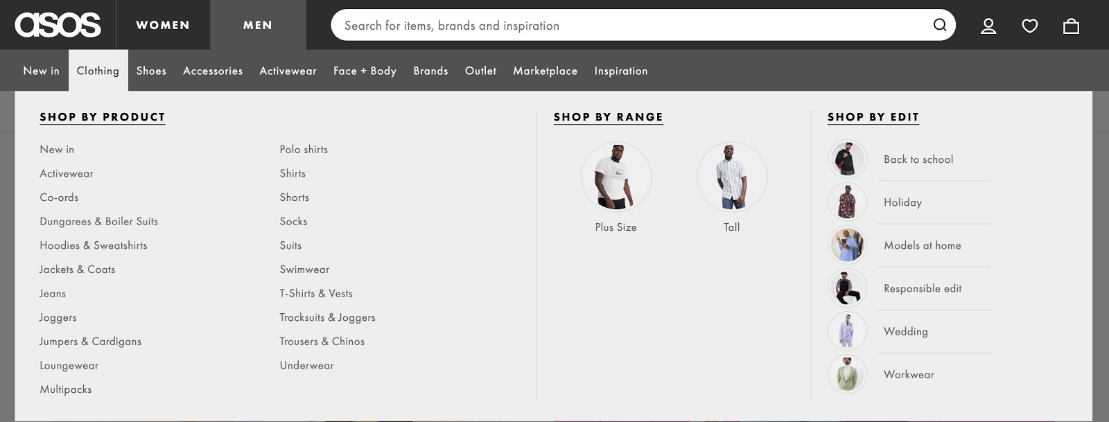
ASOS uses a variety of categories and subcategories to explicitly identify the types of products it’s offering. It’s obvious that they’ve done a lot of research about who their target audience is, as they’ve also added to their drop-down menu in the “Shop By Activity” section, which really helps shoppers focus on the items they’re searching for.

But simple navigation doesn’t only help to give customers great user experience. It can also help you increase your average order value. Think about it – consumers who find it easy to identify the items they’re interested in are far more likely to continue searching, even if they’ve already discovered what they’re looking for.
So, try to make sure that it’s a piece of cake to navigate your shop. A good tip here is to ask a friend or family member to try and locate a particular product in your store and just see what they’re doing. If they like the product for the first time, you’re all fine, but if they’re struggling, consider making some improvements.
3. Optimize your product page
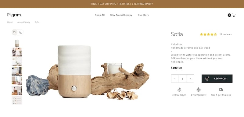
I like to think of product pages like book covers. Honestly, there are so many similarities here. A great book cover has an appealing picture, a simple title that helps you understand what the book is all about, and a synopsis on the back with more detail. All of the above can also be found on the product pages – you need attractive images, concise product names, detailed product details, and details about the sizes or colors available about your product page.
The hard part of designing your product pages is finding the right balance – you can’t add too much information because it will make the page look cluttered, but you can’t add too little, or you could leave your pages lacking in necessary details. We know it can be hard to come up with great product pages, so here are some important tips:
- Images: Try to add at least 4 high-quality photos on your product page.
- Title: Be appealing, concise, and consistent with the product you’re introducing.
- Description: Speak to what your customer is looking for. Write your descriptions with your brand voice in mind.
- Reviews: Social proof is a powerful tool to convert sales in eCommerce. Leverage reviews from your past customers to help you to convert new customers.
- Stock meter: Consider displaying the number of products left in inventory. If a product is running out of stock, this could create a sense of urgency that will help you to convert customers faster.
- Call-to-action (CTA): Include one clear CTA to encourage viewers to take action.
Read more:
Keep in mind there’s no one-size-fits-all solution to product pages, it’s all about what suits the audience the most. Some businesses, such as Bodybuilding.com, are developing detailed product pages with a lot of detail, as seen in the following snippet:
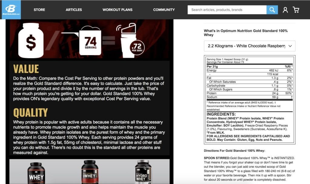
This is an ocean of text, but if you’re buying fitness supplements, you’re likely to be interested in all of these details. Other products, such as Palace Skateboards, use limited text on their product pages:

Palace succeeds in using minimal text and only letting their high-quality product images speak for themselves. Both of these brands are popular because they have developed their own style that suits the needs of their customers, and that’s something that you should aspire for. Check the various variants on your product pages to see which one works well for your audience.
4. Optimize your checkout process
Whenever a shopper gets to your checkout tab, they’re only a few clicks away from making a deal. All the hard work you’ve put into building your store and implementing marketing campaigns is so close to paying off. But then the shopper does not make a purchase. Instead, they leave your website
Now, there are a variety of theories why this could have happened. But one thing to remember is that it may have been the checkout process that made them leave. So be aware of the checkout process. Does that look trustworthy? Do the designs complement the rest of your website and fit what you would expect from a professional business?
=> read more: 10+ Trust Badges That Can Increase Your Conversion Rate
Is the checkout process easy? Do you ask any customer to sign up for an account before they make a purchase? If you do that, is that really necessary? Most importantly, do you want to go through the checkout process? Go through the entire flow and check if there are any noticeable improvements that can be made.
Start your homepage, find a product, add it to your cart, head over to the checkout, and place a test order. Was it easy to do? More specifically, can it be easier? Generally, the best checkout processes require as little time and effort as possible from your customers. It’s fun to look for products, but paying for them isn’t. Make it as easy as possible for your customers to get what they want – and you’re going to have a much better chance of converting them.
Learn more:
- How to Edit Checkout Page in Shopify
- How to collect customer emails from the checkout
- How to Test Checkout Process on Shopify?
- Add a Logo to the Checkout Page on Shopify
5. Provide transparent policies
Earlier I have discussed confidence and trust, and how important they are in the relationship between eCommerce businesses and shoppers. One of the strategies you can use to create trust and help you start converting your traffic to sales is transparency. Be transparent, open, and honest with your customers.
Make sure that important pieces of information, such as your return policy or delivery times, are readily available to your potential customers. Customers need to be able to access this information – crucial information for certain shoppers while they’re thinking of making a deal. Plus, you don’t have anything to hide, so don’t feel the need. If you’re looking for a good example of openness, Burt’s Bees is a brilliant one.

They have very prominent pages on their website banner outlining the products they use, and facts about the brand and the values they hold. Simple and easy to find. It’s fine. But what about the privacy policy? How do I know if my private information is going to be kept secret after I’ve made an order? Okay, let’s scroll down to the bottom of the page, which is typically where companies place this detail. Here’s what you will see:

Here are the privacy policy, the terms, and conditions tab, and much more detail about the philosophy of skincare. Bonus points for social media buttons, too – you can check their social networks and search their content for even more feedback if I need it. These may look like subtle additions, but all of these are measured and will help you turn traffic to sales. So, take a look at your store and answer: are you open about your policies? If you’re not, now is the time to adjust – it could be the barrier that’s stopping your traffic from turning to sales.
Read more:
- 11 Best Online Privacy Policy Generators for Shopify
- How to Promote & Advertise Shopify Store
- How to Build the Perfect Shopify Homepage
- 10 Terms And Conditions Generators You Can Trust
- How to Add Social Proof To Shopify
Final words
So that’s it! These are what you can do if you want to convert your Shopify traffic into sales. Take the lessons from this post and apply them to your store as soon as possible – some of these tips might be a problem solver for your business. Please feel free to leave comments below for a further discussion on this topic.
New Posts


